Desktop & Mobile Web


Desktop & Mobile Web
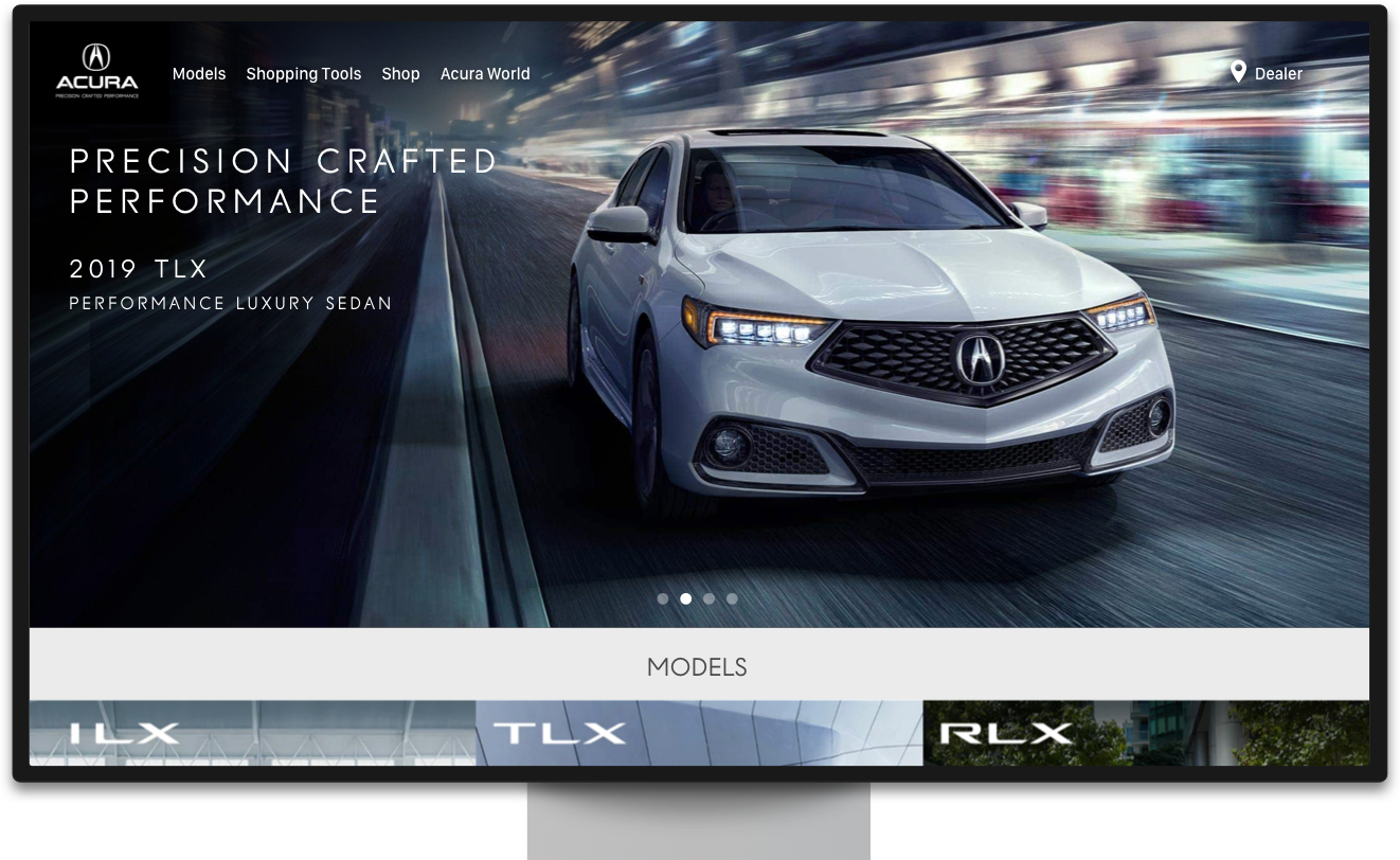

Web & Mobile Web
About the project
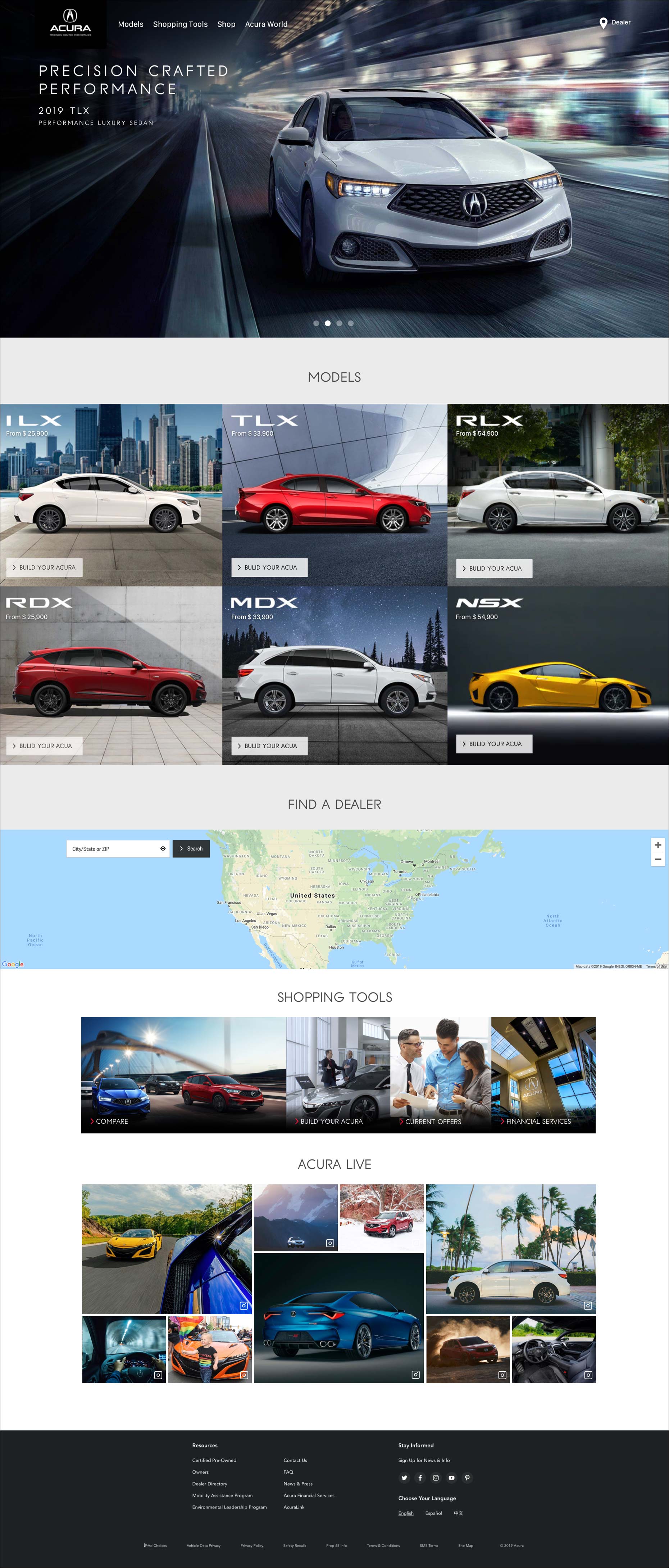
Acura enlisted the expertise of MXM Agency to revitalize Acura.com, an automotive brand site with the esteemed rank of #1, according to JD Power & Associates. The primary objective was to initiate a comprehensive overhaul, crafting an entirely new website.
The focus is enhancing user experience, ensuring seamless functionality across various screens and devices, and achieving optimal performance at every touchpoint
My role
In close collaboration with the Director of User Experience and the Creative Director, I worked on adapting the information architecture and visual elements from the desktop version to the mobile web interface. The design phase entailed the creation of mobile-specific information layouts and visual designs to ensure a seamless transition across different devices.
I developed interactive demonstration prototypes to enhance user interactions and user-friendliness, which allowed us to fine-tune complex interactions and refine the overall experience. Regular client presentations were conducted throughout the design process, showcasing both the evolving designs and the interactive prototypes. This iterative approach ensured continuous client engagement and feedback, producing a polished and effective result.
About the project
Acura contracted MXM Agency to give Acura.com, ranked #1 in automotive brand sites by JD Power & Associates, a refresh.
The goal was to create a new site from the ground up. Optimizing the experience to work across all screen and device sizes.
My Role
I collaborated with the Director of User Experience and Creative Director, adapting information architecture and visual components from desktop to mobile web.
The design process required creating mobile-specific information and visual design. Interaction demos were created to refine complicated interactions. Designs and demos were presented to the client at regular intervals.
Tools for the job


Tools for the job


Responsive
All pages designed to work across all devices and screen sizes.
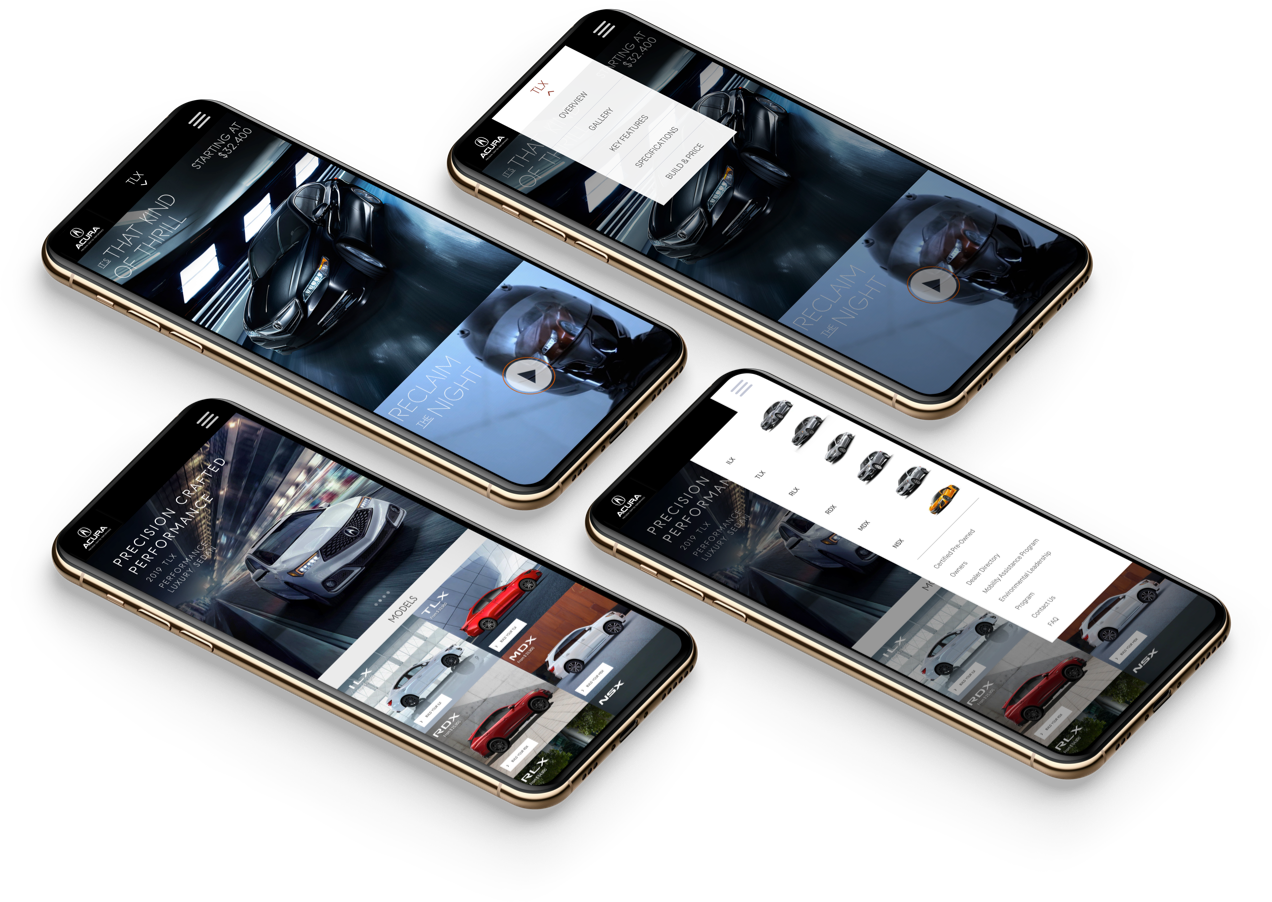
Phone
Following extensive deliberation within the MXM team, we decided to focus our design efforts on optimizing for the iPhone and the two most prevalent Android phone resolutions. To enhance performance and reduce loading times, we harnessed the power of Adaptive Images™. This ingenious technology dynamically serves images tailored to the user's device, resulting in a streamlined experience and improved performance.
While this approach necessitates a slightly higher degree of development effort, the trade-off becomes evident in the augmented user experience on mobile platforms—especially in scenarios where broadband access might be constrained. Our commitment to refining performance and user engagement led us to adopt this forward-looking strategy.
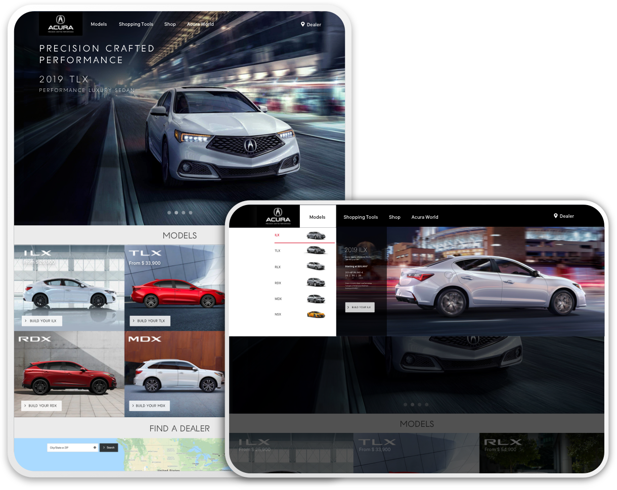
Tablet
We meticulously synchronized the tablet experience with the desktop version, factoring in potential variations in bandwidth, particularly the slower speeds often associated with wireless connections in contrast to the swifter connectivity of desktops linked via WiFi. In addition, we crafted the interface to seamlessly accommodate touch interactions, optimizing the user experience for tablet usage.
To further enhance performance and responsiveness, we employed mobile detection software. This enabled us to deliver lighter content tailored specifically to mobile devices while strategically eliminating redundant or unused JavaScript and CSS components. These strategic implementations collectively contributed to an elevated user experience across various devices and network conditions.
