
iOS Native Application
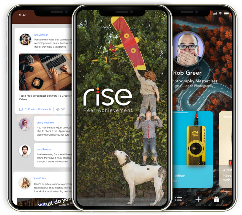


iOS Native App
Overview
As a new year unfolds, it's natural to envision a fresh start and set resolutions. Perhaps one of your aspirations is to master the art of playing the guitar. Consider reallocating some of your social media time toward pursuing your musical dreams. However, the question remains – where to begin?
Enter the RISE app, specifically designed to tackle one of the most formidable challenges in learning anything: taking that initial step. With RISE, embarking on your journey becomes seamless. The app serves as your guide, aiding in the commencement of your endeavors and connecting you with a mentor who can provide guidance. Moreover, RISE ensures you remain committed to your objectives, fostering an environment where your aspirations are transformed into tangible accomplishments.
My role
A successful product is built on a foundation of a dependable design process. By segmenting the project into manageable sections, the design team can meticulously outline the necessary steps for accomplishing each facet.
This design process transcends the boundaries of scale – proving invaluable not only for global product development but also on a micro-level when intricately crafting graphics and interactions.
Diverse approaches can be harnessed to navigate this process effectively.
Tools for the job


iOS Native App
Overview
The beginning of a new year, and like every year you’ve probably set a list of resolutions. One of the resolutions on your list may be to learn to play the guitar? You likely can take some of that social media time and relocate it to your guitar dreams.
But how to start?
The RISE app is meant to solve the most difficult problem learning anything, starting. RISE can help you not only start but find a mentor and hold you accountable so you can achieve your goals.
My role
The successful product starts with a reliable design process. Breaking the project into manageable sections allows the design team to define the steps needed to accomplish each section.
The design process is indispensable on a global product level. The application of the same process is also handy on a micro-level when designing graphics and interactions. There are a number ways you can approach this process. I have used the following to great success.
Tools for the job


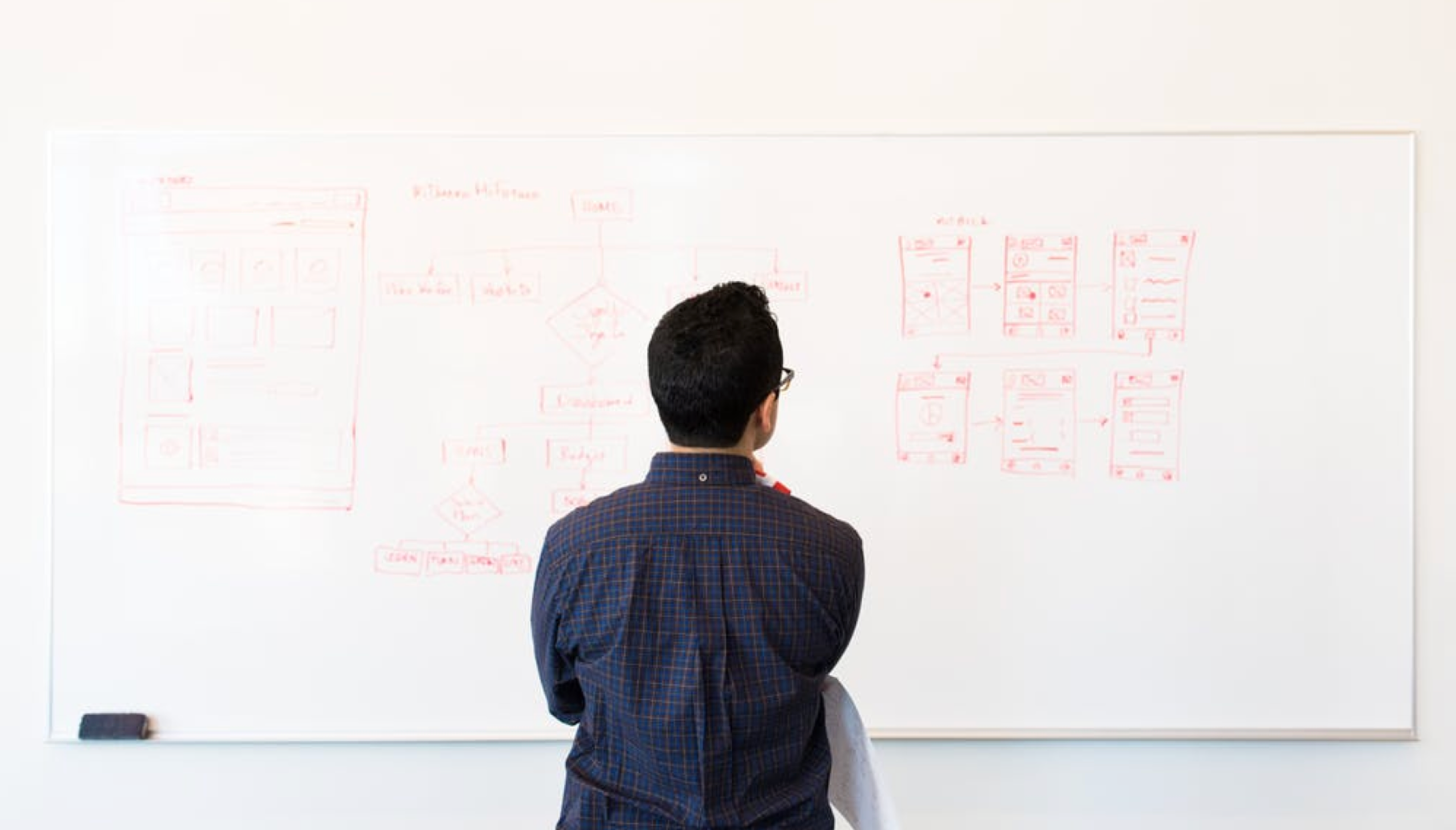
How We Got There
Develop a transformative goal achievement application that empowers users to enhance their lives and reach their aspirations. The client's directive involves crafting intuitive interaction flows for both the app and its accompanying website. Keep the following key aspects at the forefront of your design process:
The Challenge
- Design an interface that shatters the monotony of conventional calendar and scheduling systems. Embrace innovation and creativity to deliver an engaging and captivating user experience.
- Enable users to effortlessly upload various media types such as photos, videos, web links, and more, ensuring a seamless integration that doesn't disrupt the ongoing activity stream..
- Facilitate users in effortlessly transitioning between multiple direct messages with ease and fluidity.
- Create a genuinely distinctive solution that stands out and effectively addresses the intricate UX challenges inherent in project management, scheduling, and progress tracking, all enveloped within a personalized social network experience..
I predominantly use my phone over a desktop, despite some drawbacks. This preference allows me to delve deeper into complex UX issues, often overlooked when using a laptop. My peculiar aspiration is to design everything using an iPad. Although considerable progress has been made since the first iPad's release a decade ago, tablets aren't yet fully functional for this purpose.
I'm sure you're familiar with the anxious feeling of starting something new. The questions pile up: Where should I begin? Am I as skilled at planning as I believe? Who possesses the necessary knowledge to assist me, and will they mind if I ask for help? How much time will this endeavor demand? What if I encounter obstacles? What if my motivation wanes?
Once you initiate the project, most of your interactions will likely occur through digital communication with friends or colleagues, those who kindly agreed to be part of your personal support group. The process involves intricate e-communications, utilizing existing tools like calendars, meeting schedulers, email attachments, and various Slack channels. This amalgamation often results in stress and confusion, far from ideal, even in the best times.
Consider a scenario where one of your colleagues or friends wishes to present an idea for group feedback. This could quickly lead to disorder. Implementing an individual message timeline for each participant could significantly enhance the cohesion and effectiveness of these interactions.
Defining Key Pain Points
So we have a few key pain points to solve:
- How to alleviate anxiety when beginning a new endeavor
- Fostering unity among scheduling, messaging, and project management
- Balancing personal goals and group discussions through effective siloing
Execution: Design
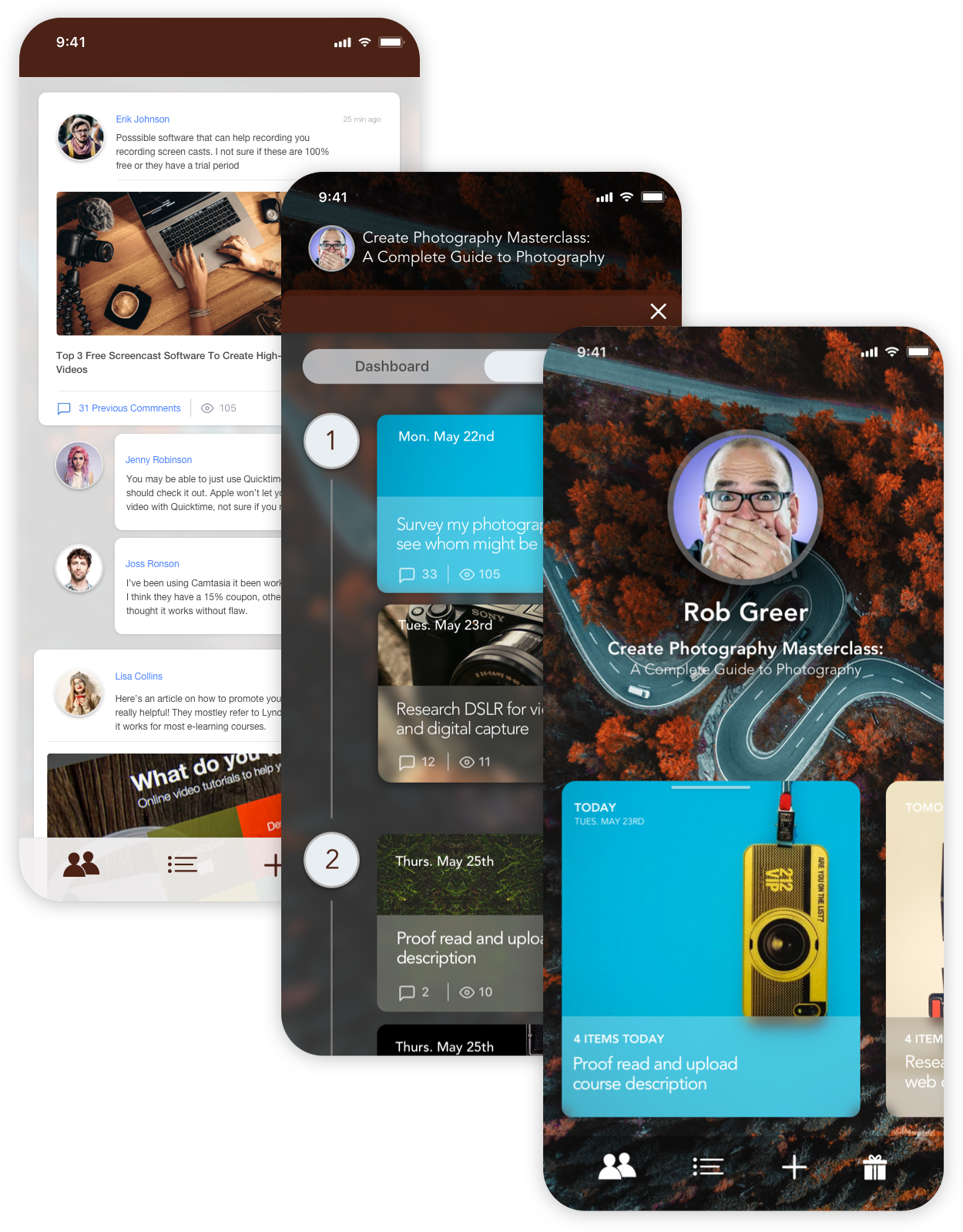
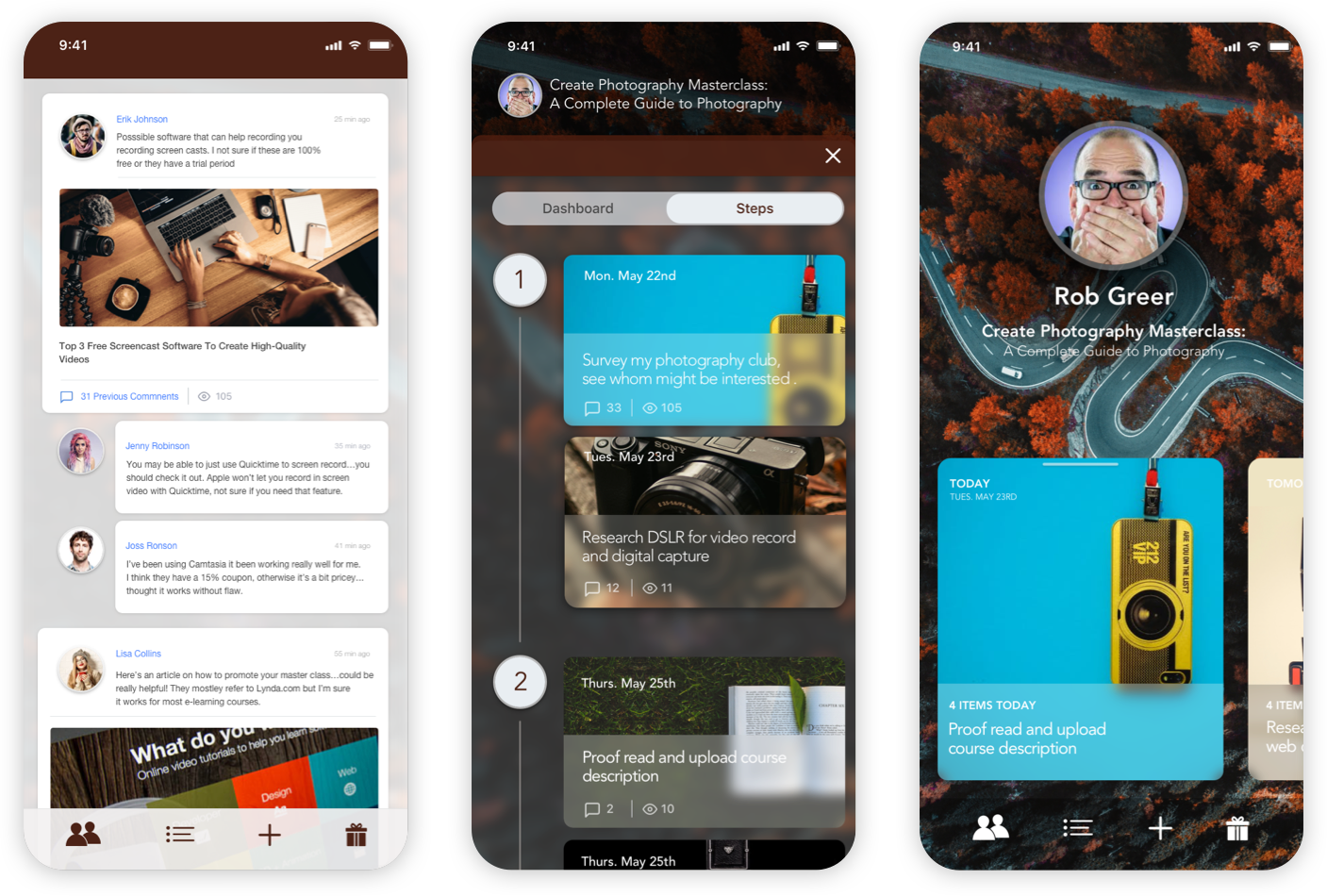
Throughout the design process, my objective was to cultivate a sense of familiarity and comfort, reducing anxiety and creating a familiar interface.
Reducing the feeling of anxiety:
• White space is a trusted ally - Afford your content the luxury of breathing freely upon the canvas.
• Elevate the Visibility of Calls-to-Action (CTA) - Restrict their use to a single instance on each page.
• Exercise Restraint with Animations - Excessive animations can provoke anxiety and be disorienting.
• Embrace Colors of Depth and Contrast - Using vivid hues and color contrast facilitates comprehension.
• Create Reader-Friendly Content - scanable, inviting, and uncomplicated.
• Reduce learning curve - The users don't have to learn a new system, with their existing mental model.
• User Retention - As there is no learning curve involved, the user is able to complete their task without any fuss, the users will continue using your product
• Improve usage speed - Using a known solution, helps reduce cognitive strain, and thus speed.
• Designers Benefit - This speeds up designers flow but also helps to create a product that gives a seamless experience to its users.
Creating a familiar interface:
Execution: Prototyping
Prototyping was primarily reserved for intricate interactions. Starting with high-fidelity visuals, I crafted interactive animations under "Looks Like" and "Works Like" concepts. While not fully functional, these prototypes aimed to test the effectiveness of the UX to facilitate task completion.
This project served as a powerful source of motivation for me. Collaborating with visionary founders, I led the implementation of a robust UX design process within our team. By employing an iterative approach, we consistently elevated and polished each stage of our design journey. The active participation of pertinent stakeholders enriched the design process, culminating in a streamlined and exceptionally effective user experience.
Our learning curve was steep. While some lessons were gleaned from our immediately, the most valuable insights emerged from our setbacks. These were not catastrophic or fatal in terms of product or development, but rather gaps in our design methodology. Identifying these gaps spurred us to devise solutions, resulting in a more refined and resilient process that propels us forward.
And a golden rule always resonates: kindness prevails. Fostering harmonious relationships with colleagues is paramount, as a negative demeanor can alienate even the most talented. The art of listening to fellow team members yields invaluable perspectives. Ultimately, approach your work with unwavering focus and empathy, for the realm of design is both intricate and demanding.
